New look for www.emanueleferonato.com
The blog is approaching Alexa’s top 50,000 (and I like to think it’s one of the most 50,000 visited sites in the world) so I spent the weekend to redesign it.
After browsing a thousand of templates, both free and not free, I decided to download Silhouette WordPress Theme and take a look at Macalicious and changing a lot of things and this is the result.
It’s far from being finished but I wanted a feedback from users.
With the new look I want to focus the blog on contents. I removed Adsense injections because I want posts to be ads free for a better reading.
I also have some other stuff to add on the blog but after two days of hacking, coding, deleting, installing again, hacking, coding and so on I am really tired :)
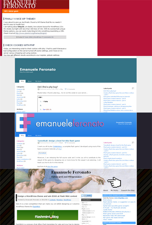
For the old-time readers, I am publishing an image showing how the look of the blog changed during these two years.

Hope you’ll like this first version of the new look, and obviously now I know a lot of things about WP and I will share with you next days.
You will be pleasantly surprised by WordPress Themes provided by Template Monster. All of them are of professional design and high quality.
39 Responses to “New look for www.emanueleferonato.com”
Leave a Reply
Trackbacks
-
One of the top 50,000 sites in the world : Emanuele Feronato on
August 18th, 2008 9:32 pm
[...] I said in the post New look for http://www.emanueleferonato.com, I am on top 50,000 sites according to [...]
- Get up to $100,000 for your next Flash game with Mochi GAME Developer Fund
- Create a dynamic content animated footer ad for your site in just 9 jQuery lines – 17 lines version
- Sell sitelocked version of your Flash games and even .fla sources to Free Online Games
- Protect your work from ActionScript code theft with SWF Protector
- Create a dynamic content animated footer ad for your site in just 9 jQuery lines
- Understanding Box2D’s one-way platforms, aka CLOUDS
- Triqui MochiAds Arcade plugin for WordPress upgraded to 1.2
- Box2D Flash game creation tutorial – part 2
- 11 Flash isometric engines you can use in your games
- Monetize your Flash games with GamesChart
- Create a Lightbox effect only with CSS - no javascript needed
- Flash game creation tutorial - part 1
- Create a Flash Racing Game Tutorial
- Flash game creation tutorial - part 2
- Make a Flash game like Flash Element Tower Defense - Part 2
- Flash game creation tutorial - part 3
- Make a Flash game like Flash Element Tower Defense - Part 1
- Create a flash draw game like Line Rider or others - part 1
- Triqui MochiAds Arcade plugin for WordPress official page
- Create a flash artillery game - step 1
- Flash game creation tutorial – part 5.2 (4.88/5)
- Create a flash artillery game – step 1 (4.79/5)
- Create a Flash Racing Game Tutorial (4.76/5)
- Create a flash artillery game – step 2 (4.74/5)
- Create a survival horror game in Flash tutorial – part 1 (4.73/5)
- Creation of a Flash arcade site using WordPress – step 2 (4.73/5)
- Flash game creation tutorial – part 2 (4.71/5)
- Flash game creation tutorial – part 1 (4.70/5)
- Create a flash draw game like Line Rider or others – part 1 (4.69/5)
- Creation of a platform game with Flash – step 2 (4.68/5)


I SAW YOU CHANGE THEME WHILE LOOKING YOUR BLOG… switched pages and woah!
too PIIIIINK! nooooo
well.. as long as the material in here doesn’t change i don’t care :)
keep up the good work
Actually I am looking for some red and blue to change some pinks
pink..pink…pink…se a little bit less pink and as you said, blue will look good and red will also work
The colour isn’t really to my personal taste. I think you could also make the header more prominent.
I’m with Orion, if the content is here, I don’t mind.
But I’d call the logo out on something, the text is hard to see on the background (at least, on my PC)
this theme is not really good :(
Hmm…
I don’t like this theme much…I makes me kindda want to leave the site…try more organic colours this is a bit to pink and crazy
Also try move everything around a bit…
It’ll grow on me.
Oh dear…
I am trying another color scheme right now…
pink is cool. don’t change it! :)
This is so bland. Sorry but I think your last one was a lot better. I hope you can spice this one up a bit.
Ew…worst one yet. I liked the theme that you had before this. If you simply kept your last theme and maybe just changed the font of the title I think we could call it good. :P
I hope you change it back…
This theme is worse…
The old theme is much better…
I personally prefer the last design.
I like the them with the pixel EF.
This one would be cool if you could hide the sidebar!
Well, I LOVE purple, even though I’m a boy, so there’s not much wrong with the title or the background… Pink’s ok for me, but nobody should let the colour put them off such an amazing site as this!
I’m here since the 3 last themes and I don’t really like this one.
As it been said already, if you decide to keep it I guess it is ok if the quality of the post remain the same.
I prefer the second to last one with the EF and stuff. That was great.
oh geeez this is bad…
I’m sensing a general consensus that the previous theme is better. Personally, I think it needs some more pizazz
I like it when under “Recent Posts” in the side bar it has the date above the post. I really like the theme you just had. Pink isn’t a very good color. I liked the stripes as the background. I’m not demanding, but it would be nice. I agree with Mr. Sun, it needs more pizazz. The old theme had it, the painting and the mouse. This theme will probably grow on me.
Oh, and the title is kinda hard to read because the colors are so similar.
I was getting sick of the old banner. The first time I saw it I loved it. But ever since it’s reminded me how geeky I was.
New theme is decent. But I don’t like the purple pink with the orange. Purple blue works fine, purple pink can work too, but the orange of the news posts threw me off.
Oh and just a note, I don’t think the bright green image on the second post is helping users like this theme by making it seem full of colour.
MY EYESSSSS!! why emanuele? WHYYYYYY?
well, its has a lot of contrast, and that seems to make the page look a bit cheap, but it honestly doesn’t matter if the content is the same. Try out a couple of different colors, or use a single color scheem, like red orange yellow, or blue black purple, or idk…im not a color expert…
i really like the new logo though
Ci sono dei problemi con questa versione.
hey, ive been reading this blog since about hun 2006, and this is my worst theme so far, i liked the 3rd one, with ef merged, and blue header, maybe add some gaphics to that and use the previous background (your 2nd newest layout).
Just a suggestion!
Keep the tutorials up!
hi, there is so much great content on this site it really needs a clear search box
Is the background supposed to be black? Because it’s not showing up
The more I look at it the more it grows on me. It’s a nice clean layout. I think you should switch from the pink though!
what logo?
sorry it gets no love from me :(
needs more white space, lose the pink. highlight the blog titles more and make the header more prominent.
however i love your content so i’d keep visiting regardless
Personally, I liked the one pixel EF. Maybe two sidebars?
I really do not like this design. Sorry.
Change the pink, and it would be good.