Improve your brand with a logo
- December 16, 2008 by Emanuele Feronato
- Filed under Reviews | 29 Comments
Every company should have one little (and sometimes not so little) graphic displayed next to its name, and sometimes this graphic becomes so famous that people will recognize the brand just looking at the graphic.
Just look at these logos

There isn’t any name next to the graphic, but you surely recognized the companies just with a brief look at their logo.
So if a logo is important for a big company, it must be important for a small company too, or even for a personal website.
Having a polished, well designed logo will make your page look more professional. The more polished and original your logo, the more chances people will remember it.
That’s why I wanted a logo for the blog.
I designed about a dozen logos for some companies around here in my career, but I wanted to try a company that is specialized in logo design. So I googled for “logo design” and started watching the portfolios of some companies listed in the results page.
I was impressed by logos made by The Logo Company so I decided to buy a logo from them.
I purchased the basic package for $149 that included 5 mock-ups to choose from, unlimited revisions and initial concepts in three business day.
Let’s see what happened:
December, 7th
I placed the order. I had to fill a form with some information about the logo I wanted, such as the style (illustration, text based, …), the feel (high tech, corporate, …), my preferred colors and so on.
I wanted something like an avatar, so I sent them a picture of me.
Then I had to pay in advance. It was sunday, so nothing else happened.
December, 8th
A project manager was assigned to my logo, and wrote me an email saying he would send me the initial designs in a couple of days.
December, 9th
After only one business day, I got five design concepts. Being just concept, they wasn’t that polished, but I liked this one:

I liked the deformed look… but I don’t have blonde hair nor I like green shirts… so I wrote them about it.
December, 12th
I got four revisions of the logo I choosed, and I had an hard time having to choose between these two logos:

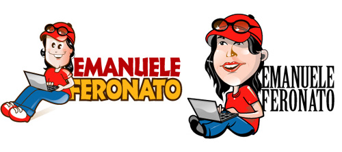
I loved them both but I decided to continue with the rightmost one because it looks more like me. I just asked to change the font, but I already decided to use the logo without my name, or with my name written by me. A geek always has to mess around with everything.
December, 15th
I got my logo in various formats, included the master I can edit with Adobe Illustrator.
Now that’s my logo:

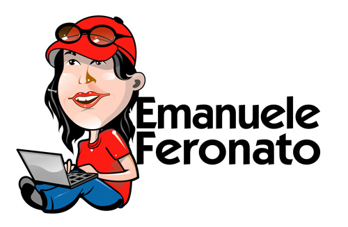
Expect to see it on the new blog design coming “soon” and in my next Flash games.
» A well designed logo be be very important when it comes to branding your name, and a good logo can be used for all kinds of great promotional products and other types of marketing strategies to increase brand awareness.
29 Responses
Leave a Reply
TUTORIAL SERIES:
- Una guida completa al gioco del poker online e una selezione dei migliori casino online.
- casino online
- migliori casino online
- BlackJack online
- casinò online


(7 votes, average: 3.43 out of 5)

Just a quick note… you look a like a girl. Are you a girl? Can we see what the image was based off?
Realy, this character is like a girl. Look at the bosom.
You can find the photo I showed them in my facebook profile,
http://profile.ak.facebook.com/v226/2007/64/s1166834715_890.jpg
I also find that it looks kind of like a girl but if you like it, i’m fine with it. I would’ve placed your name a little righter than that. It looks really all crammed up.
Its look like a girl, your libs look like have lipstick and your hair is…
Most all famous logos don’t have people , there is a shape, a shape that says something. the windonws is like a window, the apple is like an aple, the Quicktime has something like a clock and a “Q”
The bubbleBox has a character of video game that I will forever remember. Armor games have something medieval, the sword and the shield, newgrounds has a tank (I still can’t guess why, but its pretty famous).
You’re right awoke, but this is a personal blog and I wanted something personal.
errr, but I didn’t like it, enjoyed more that one which was a header, which have a famous picture and a cursor seeking to a man finger
Dude, I thought you were a guy.
:P
this one, http://wp-premiums.com/wp-content/uploads/2008/02/ishot-110.jpg
maybe transform it in a logo can be cool
i think it should be more simple than that.
there’s too much going on in the logo.
you should make the focus more on programming.
suggestion: an old computer (the one’s with green letters)
i can try to make you a logo…
get back to on that later
Well, I like the logo because it reflects interesting things like italian style and computer programmer(and geek!).
I’m not that keen on it myself, but if that’s what you want then that’s what you should have!
This logo is pretty slick, and is a steal for $149.
Good call on the font change. The second font represents the blog a lot better. I am interested to see the new blog redesign based upon the logo and how you convert it into a favicon.
Once you have your logo, you can make it into a little icon that you see next to the address bar or on a favorites list. I found this on dynamicdrive.com:
http://tools.dynamicdrive.com/favicon/
very nice! I like the mario feel of it :)
It´s not that bad. A logo of a flashgame-maker should not look too serious.
Woot! Logo!
Personally, I liked the one on the left, though. Think you could make a favicon outta it?
Cheeseberger92; I am sure that he knew that. It is called a favicon
i thought your logo was http://wp-premiums.com/wp-content/uploads/2008/02/ishot-110.jpg , thats what i remember you by anyway.
Yeah.. you look like a girl in this logo. Perhaps you can ask them to change it to be more masculine.. Add some hairy thing on your face,hand etc.
Yeah, you do kinda look like a girl in this logo :P
It’s still pretty cool though, charicature wise :)
I really liked http://wp-premiums.com/wp-content/uploads/2008/02/ishot-110.jpg , it would make a pretty good logo if it was updated.
Yeah, you look like a girl there.
Here is my try:
http://img156.imageshack.us/my.php?image=testemanueleferonatopw9.jpg
I also belive this logo isnt as good as one would like to get for $149. Personally i like logos to be alot more simplistic.
A nice way to utilize this one though is to only use the head for instance and in every game or production the character changes pose or interacts with the product. This will give you a more playful image.
Probably the best thing you could get with a blog title like yours. What else could you use besides a drawing of a person?
I think it is a good idea to actually show the face of the author for small indie flasg game companies.
However, I do agree that this logo TOTALLY looks female. This is even enhanced by the gender neutral name “Emanuele”.
If you use this logo, I assure you people will think you are female.
It seems like you’ve come across a great design company here – I’ll seriously consider using them for my next logo.
While your logo looks great, I do have to agree with the other people here though, it does look quite feminine.
[...] that I have a logo, it’s time to use [...]
nice logo, but it does look a bit feminine
I honestly have no idea where you got the $149 for the logo though.
I wasn’t aware that there were any ads on your site :S
It looks like a girl, with lipstick.
seriously, your a guy, get a logo that looks like a guy